


Clementina van der Walt x Studio Matongé: Ceramics that brighten everyday life
At Studio Matongé, we love objects that bring character and color to our interiors. The “Colour Me Bright” collection by Clementina van der Walt is a perfect example. Inspired by African landscapes, both urban and rural, it combines vibrant shades and contrasting finishes, in a style that evokes both traditional patterns and the clean lines of Suprematism.
Craftsmanship in vibrant colors
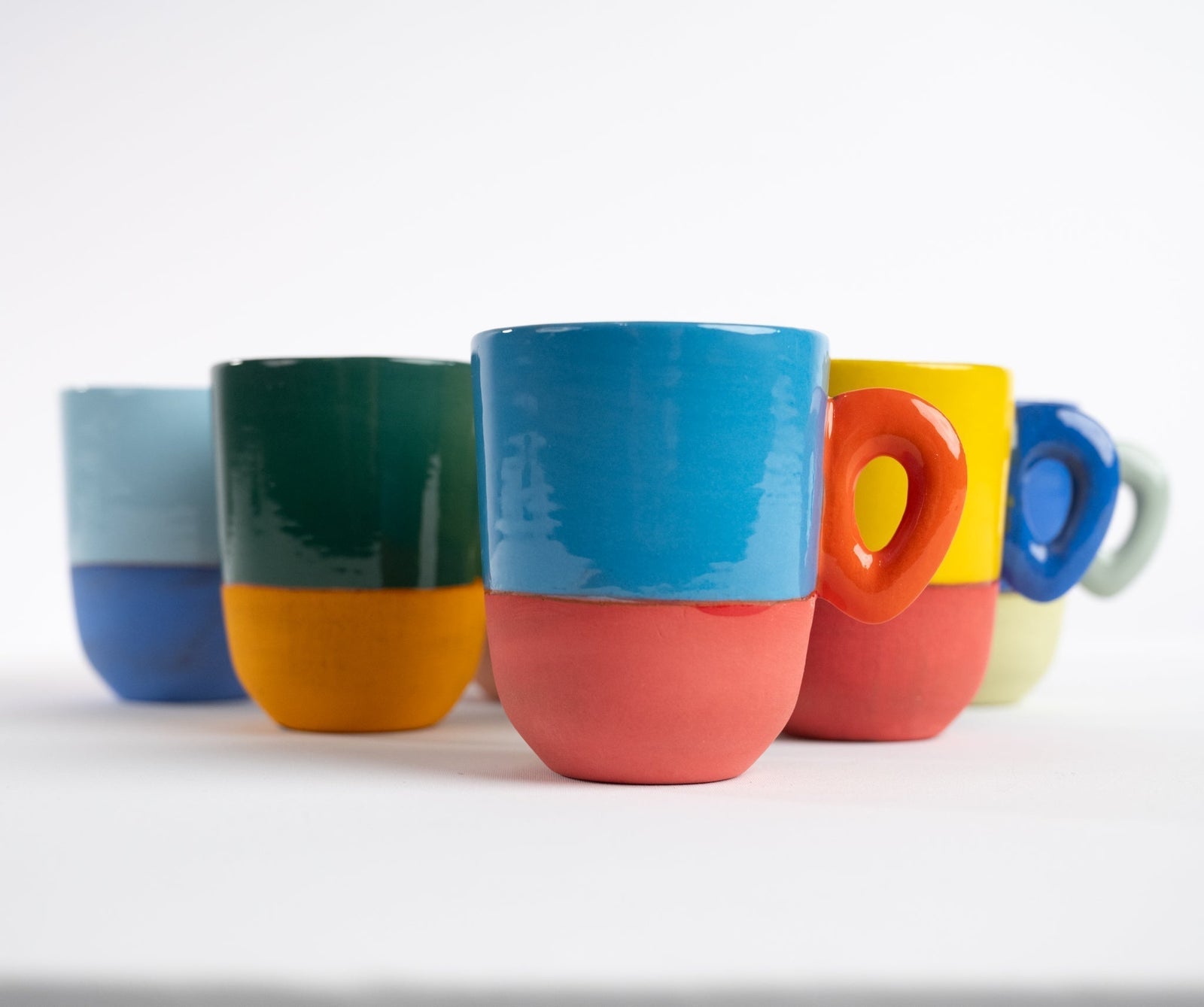
From her Cape Town studio, Clementina van der Walt creates ceramic pieces where art and function come together. Her Colour Me Bright collection plays with a bold palette: red, orange, yellow, sky blue, summer blue, lime green. Colors designed to complement, complete, and energize every table.
The surfaces alternate between glazed and matte, creating a subtle interplay of textures that enhances the minimalist shapes. This approach, which evokes suprematism, gives rise to tableware where the simplicity of the lines reinforces the impact of the colors.
“These pieces are designed to brighten everyday moments. Their brilliance adds depth to every table, whether it’s a gentle breakfast or a warm dinner.”
A collection designed to be mixed and matched
Each piece in this collection has been designed to work alone or in combination. The idea? To create a lively, versatile and expressive, table where each element interacts with the others.
🔹 Cup in ceramic – A delicate format, ideal for an espresso or an infusion.
🔹 Cup in ceramic – Clean lines and a raw feel for a bold presence.
🔹 Mug in ceramic – Perfect for coffee or tea breaks, solo or stacked.
🔹 Two-tone coffee cup – A subtle contrast between matte and glossy, color and sobriety.
The art of the table, contemporary version
Designed for everyday use, the Colour Me Bright collection is food safe and can be washed in the dishwasher with care. Beyond its function, it invites you to reinvent the art of the table: a blend of craftsmanship, design, and chromatic boldness .


